Get in touch!
Making health feel less... boring.
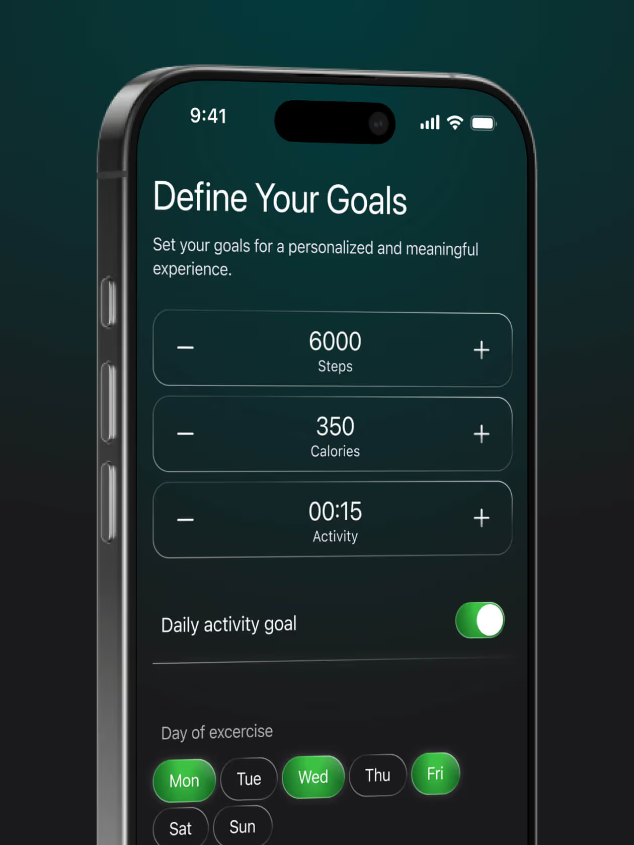
OVUS is a health-tracking smart ring. My job was to design its mobile app from zero to one. Take what works, make it smoother, friendlier, and just… nicer to use.
Mobile App Design

Cool ring. Now what?
The world didn’t exactly need another smart ring app doing the same old stuff. Sleep tracking, step counting, heart rate charts. It’s all been done.
The challenge was giving OVUS its own vibe. More human. More fresh. Less like checking your bank statement.


The process
We started fast. Wireframes helped us get on the same page about the flow and key features. No endless debates. No overthinking. Just a quick way to check if we’re moving in the right direction.
Once that felt good, I focused on crafting the best UI possible. Clean design, clear charts, friendly details. And as always, I kept the client in the loop with frequent updates: Loom videos, and quick text recaps.
Along the way, I built a simple design system with reusable elements to keep everything consistent and ready for development.


Conclusion
OVUS went from idea to a ready-to-build product in record time. Smooth flows, clean design, charts you actually want to look at. Thanks to super clear communication and quick feedback loops, the whole process felt easy.
I also built a simple design system along the way, with reusable elements ready for development. No chaos in Figma.